" I fell in love with black; it contained all color. It wasn't a negation of color...Black is the most aristocratic color of all...You can be quiet and it contains the whole thing" - Louis Nevelson
Black: it's the second most common request (after white, of course!) that we get from clients and friends searching for a specific color.
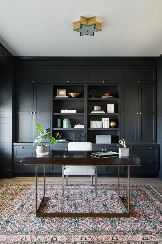
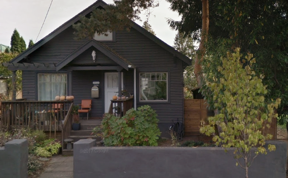
A black exterior imbues a home with a strong presence and mood, and this is where most of our clients utilize the darkest of colors. However, powder rooms are a close runner-up, as these small spaces easily lend themselves to drama and a sense of escaping the outside world.
PLEASE NOTE: Using a computer to choose paint colors can be misleading. The color displayed on your screen is an inaccurate representation of the actual paint color. Always go grab a sample or a color swatch!
Above: Jet Black by Benjamin Moore is one of our go-to shades. It’s that perfect, absolute black with no other color bleeding or reading through it. Strong and pure.
Above: Black Forest Green by Benjamin Moore is another favorite. It reads as black in shade and as a beautiful deep forest green in brighter light. Part of their Historical Collection.
Below: Hale Navy and Soot by Benjamin Moore may be chosen for a combination of blacks with a distinctly navy tone. We envision them used on trim and body for a uniform result.
Below: Witching Hour by Benjamin Moore is a softer black, suggested when our clients prefer a darker hue with less severity.
Above: Days End by Benjamin Moore is true to its name – a dusky black, evocative of the night sky as it descends and softer than a pure black.
Below: Graphite (18-18) by Pratt & Lambert complements warm wood tones and has a nice crispness without being too stark.
Below: African Night (23-07) by Pratt & Lambert is a color we find rich and warm. We most often use it on home exteriors. It is an excellent complement to cedar wood and makes a lovely backdrop for brightly colored vegetation or landscaping. This warm grey with slight purple undertones would work well in an interior space where one wished to create a soft mood.
Below: Black (25-17) by Pratt & Lambert. This color is deep. When applied in a matte finish it reads almost like velvet. Use it on interiors for an incredibly refined look.


