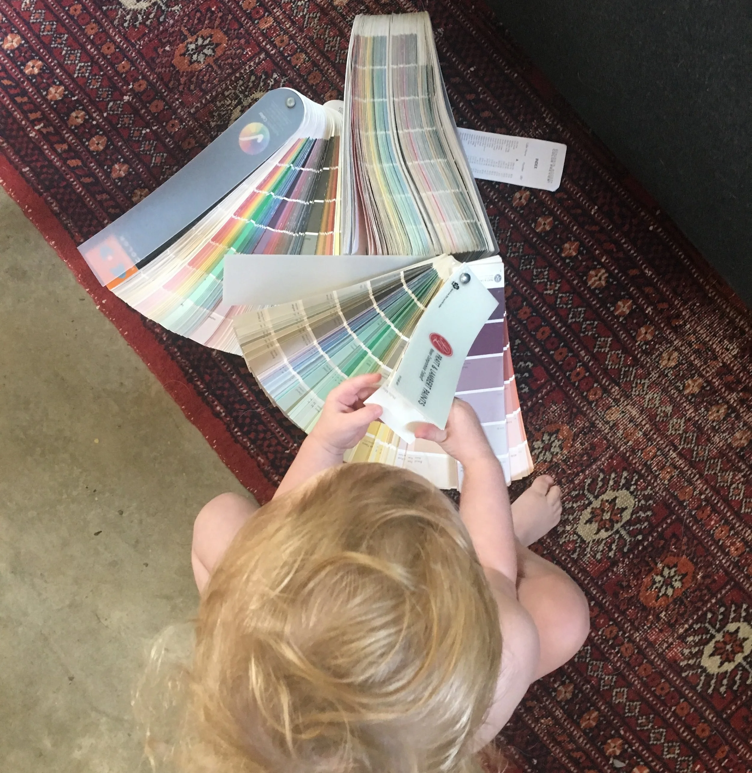
One of our most frequent questions we hear from friends, family and clients when it is time for them to paint - What is your favorite color of white?
Our response is another series of questions - is it a modern or historic space? What style furnishings are going in it? What type of natural lighting does it get? What is on the floors? This results in us sorting through our mental rolodex of go-to whites to recommend that perfect shade, best suited for each space. Below are our top 9 shades of white compiled here for your easy reference.
PLEASE NOTE! All computer monitors are not a reliable source for looking at paint colors. The screen resolution is NOT accurate of the color in person. Always go grab a sample or a color swatch!
Above: Pratt & Lambert's Seed Pearl is that perfect shade of white that compliments wood trim. It is an inviting and approachable color that has just a touch of warmth and is not too stark.
Above: Chantilly Lace by Benjamin Moore is another favorite. Slightly cool and very bright, it reads well in modern spaces and in galleries. It is very crisp and a perfect backdrop for art.
Below: We love using 2 shades of white in the same space. Benjamin Moore's Cotton Balls on the walls and Swiss Coffee on the trim are stunning as a subtle compliment, adding depth while not taking away from the furnishings or accessories.
Below: Named 2016 color of the year by Benjamin Moore, Simply White, has long been one of our tried and true resources. A clean and multipurpose white, it has little tint or tone, making it a good compliment for more defined colors.
Above: Our favorite historic white from Benjamin Moore Historic Color Collection, Monterey White is good on the exterior and interior. Refined and classic, not too bright or stark, it looks especially nice on trim. We most recently specified it as a more era appropriate color in a 1920's french Mediterranean influenced home.
Below: If you want a hint of rose or pink in your white, a subtle glow of warmth, then Alabaster is the sweetest shade.
Below: If you prefer a touch of blue or coolness in your white, one that compliments a grey, we recommend White Diamond in Benjamin Moore's Color Preview line. By itself, it reads as a very bright white but placed next to a true white you can observe the amount of color that is actually present, adding a nice richness.
Below: Part of Benjamin Moore's Color Stories line, we have been in love with Plaster of Paris ever since we got our first color decks. This white has an abundance of depth to it that is calming and refined. Rarely does it read as stark, it is reminiscent of whites in Calacatta marble and a good neutral for different styles of architecture.


