Urban modern living in a renovated warehouse
Located in Portland's Pearl District, this building was originally a warehouse in the 1920s, and was converted to lofts in the 1980s. Understanding the client's vision for a minimal, raw space, our designers took on the mission of transforming the outdated loft into a modern, industrial retreat. The client is a computer programmer and is visually intrigued by the way things work. All of these small details come together, creating a welcoming and contemporary home .
A grouping of iconic pieces—the Saarinen table, the Nelson bubble lamp, and mid-century chairs (newly recovered with locally sourced black leather seating)—anchor the dining area and create a natural resting spot between the living and bedroom areas. This visual breaking up of the space keeps the loft from feeling overly long and disconnected.
A pipe that drains rainwater from the roof of the building was left exposed in the corner, offering great sound effects on a rainy spring day.
New lighting was added and the wiring left intentionally exposed. The lines created by showing off the building's systems creates visual interest.
The long, open space of the loft is divided by the custom pocket wall that can hide the bedroom when guests are over. The closets in the bedroom were designed to mimic the Vitsoe shelves in the living room.
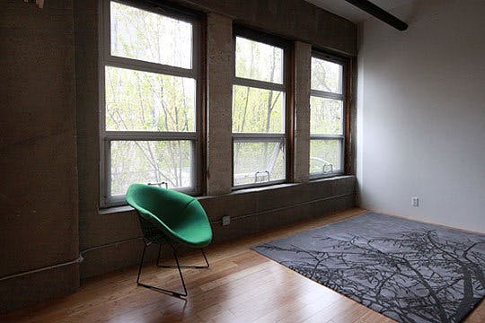
The rug in the bedroom area emulates the shadows that the trees outside of the windows create on the floor. The window treatments were chosen in a dark shade of grey to match the concrete walls and disappear visually whether up or down.
Each panel of the sliding wall is painted a slightly different tone of white to add interest.


