Imbuing a 798sq ft bungalow with period details
Through misguided remodels in the 1970s and ’80s, both the kitchen and postage-stamp sized bathroom of this 1924 Alameda bungalow had lost their original character. The goal for this home's redesign was to combine modern space planning and amenities with period details and craftsmanship. Much of this was achieved by opening up the kitchen to the dining area, as well as careful selection of space-saving fixtures, era-inspired hardware and locally made tile. All new flooring, painting, window coverings and lighting throughout complete this 798 sq ft bungalow's transformation from characterless crashpad to a jewelbox home.
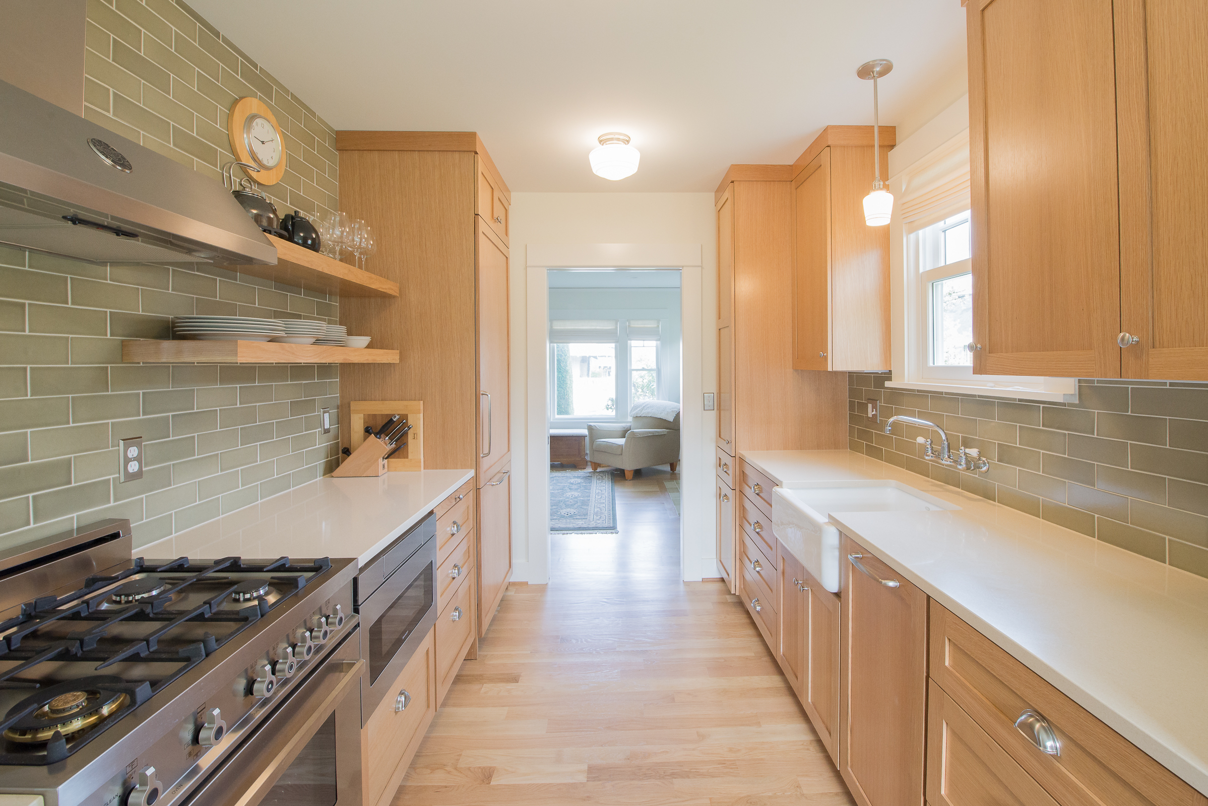
A complete overhaul of the kitchen and dining area transformed the feel for the rest of the home. With the removal of a lowered ceiling and the wall and small doorway that had separated the dining and kitchen, we were able to create a more connected space. Despite its small size, it feels large in its functionality and efficient flow. Era-appropriate details provide interest in the wainscoting, handmade subway tile, lighting and shaker panel cabinetry.
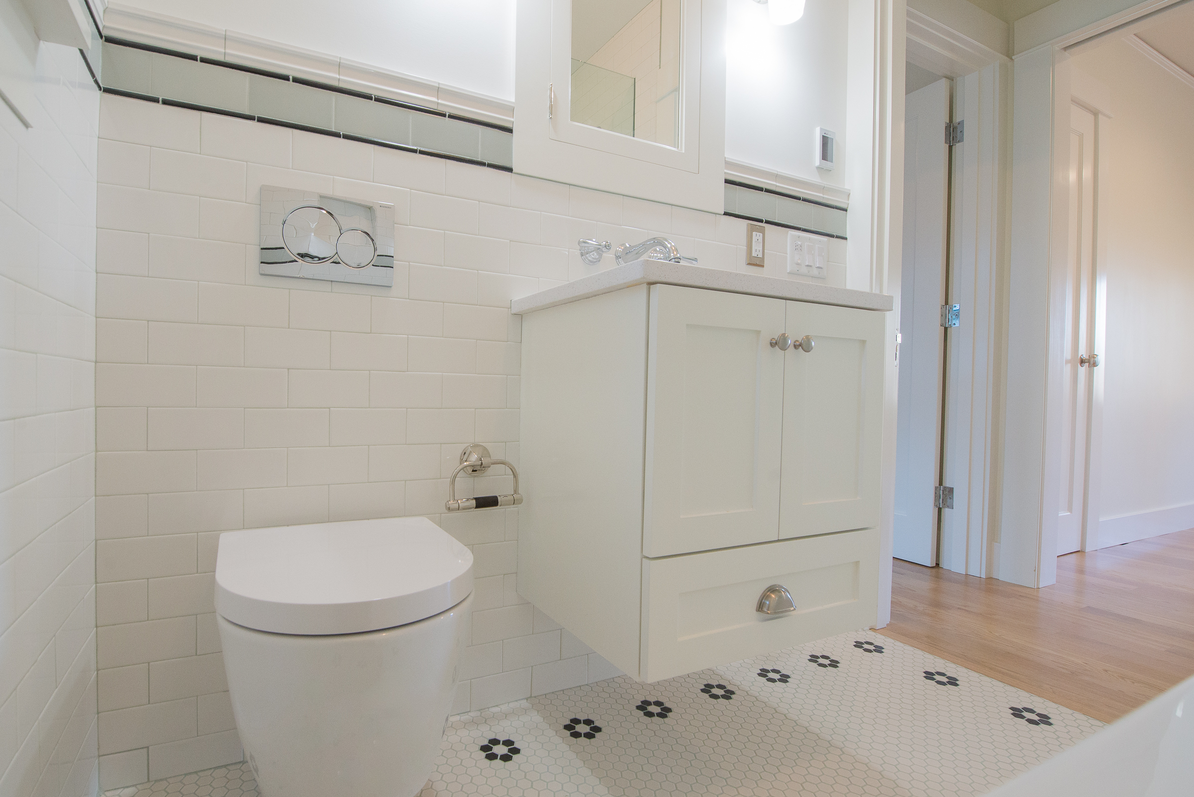
A neutral yet detail-focused package was requested by the clients for the finishes. Our goal was to make a statement in this tiny bathroom without the overwhelming use of a bold color palette. The contrast of multiple white textures—hex floors, wall tile, cabinetry, deep soaking tub and countertops—lend a sense of interest.
The bathroom utilizes the most subtle of space planning techniques: a wall hung toilet and faucet save several inches of room. The floating vanity, extra narrow and extra-deep soaking tub—paired with a glass partition instead of a shower curtain—all add to the perception that there is an ample amount of floor space.


